
The True Cost of Ignoring A Responsive Website Design
Recently updated on

If more than 7 billion people carry smartphones, why is your website still stuck in desktop mode?
Global data shows mobile usage continues to surge year after year. And it's not just smartphones anymore. From smartwatches to connected cars, people are no longer just browsing the internet—they're living on it. Your audience is reaching for screens of every size to research, scroll, compare, and buy.
And yet… too many businesses are still relying on outdated, non-responsive websites. The result? Frustrated users. Missed conversions. Damaged credibility.
This isn't just a design issue—it's a business risk.
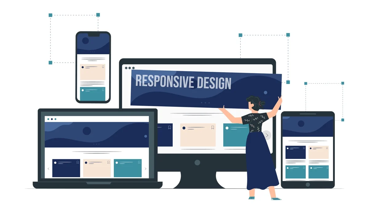
Responsive website design is no longer optional. It's the foundation of every high-performing digital presence. Ignoring it means losing leads, burning ad spend, and handing opportunities to competitors who are already optimized for every screen.
In this blog, we'll break down the hidden costs of skipping a responsive redesign—and show you how platforms like Django, dotCMS, and WordPress can help you future-proof your site, your brand, and your bottom line.
1. Loss of Mobile Traffic and Leads
Mobile devices now account for more than 64% of global web traffic—a figure that climbs every year. And yet, many businesses are still running websites that don't load properly on mobile. That's not just a technical hiccup; it's a deal-breaker.
Here's the hard truth: if your website doesn't work well on a smartphone, your visitors won't stick around to figure it out. They leave. Not because they can't navigate it—but because they don't want to. Mobile users expect convenience, speed, and clarity. Anything less, and they're gone.
Speed is another make-or-break factor. Industry benchmarks suggest that a mobile load time under 2.5 seconds is the sweet spot. Beyond that, user patience wears thin. Over half of mobile visitors will abandon a site that takes more than three seconds to load. And once that exit happens, they're unlikely to come back.
If it takes 10 seconds to respond or load, you might as well be invisible—because your visitors have already moved on to something else.
A non-responsive site only makes things worse. It forces users to manually zoom in, scroll sideways, and tap tiny links—turning your content into a frustrating puzzle. It sends a message you may not intend, but deliver:
"We didn't design this site for you."
And in today's hyper-competitive landscape, that message can cost you more than traffic—it can cost you credibility.
Whether your buyer is browsing casually on the train or deep in research mode between meetings, chances are they're doing it from a mobile device. That makes responsive website design not just a nice-to-have, but the foundation of a high-performing user experience.
By ensuring your layout, content, and navigation adapt fluidly to any screen size, you not only preserve professionalism—you keep your leads moving forward instead of bouncing away.
2. Poor User Experience That Kills Conversions
Let's say your website does manage to load—but if users are greeted with a clunky, frustrating experience, that victory is short-lived.
Hard-to-tap buttons. Menus that glitch or disappear. Forms that fail to submit. These are more than minor annoyances—they're conversion killers. In a world where users are just one tap away from a competitor, every UX misstep becomes a lost opportunity.
According to industry insights, conversion rates can drop by up to 20% for every additional second of delay in mobile page load time. That means the longer your site takes to function smoothly, the more potential revenue you watch slip away—one impatient visitor at a time.
But user experience isn't just about speed. It's about intent.
Responsive website design isn't just about making your site look good on a smaller screen. It's about designing with purpose—especially for mobile-first users. That means prioritizing:
- Effortless navigation
- Clickable (and thumb-friendly) calls to action
- Clear, concise messaging
- Forms that work
These aren't just design preferences—they're essential ingredients for a high-performing user journey. And responsive design gets them right, by default.
In short, good UX keeps people engaged. Great UX turns them into customers. If your site isn't responsive, it's doing neither.
3. Lower SEO Rankings (Mobile-First Indexing Is Real)
If your website isn't mobile-friendly, it's not just turning away users—it's being quietly buried in search results.
Google made it clear: mobile-first indexing is now the standard, not the exception. This means Google primarily uses the mobile version of your site to determine how it ranks in search. If your mobile experience is slow, broken, or incomplete, your visibility suffers—regardless of how polished your desktop site may be.
According to Google Search Central, websites that fail to serve equivalent content and functionality on mobile risk being under-indexed or misrepresented in search rankings. In other words, if your mobile site doesn't reflect your full offering, Google may not see it either.
Responsive website design plays a direct role in supporting your SEO performance by improving:
- Page speed, which is a confirmed ranking factor.
- Core Web Vitals, which measure how users experience your site (e.g., loading speed, interactivity, and layout stability).
- Crawlability and indexability, ensuring search bots can properly navigate and rank your content.
- Content parity ensures that your mobile and desktop users (and search engines) get the same value.
Gone are the days when keyword stuffing could boost your rankings. Today, technical performance and user experience drive SEO—and responsiveness is foundational to both.
That's where modern platforms like Django, dotCMS, and WordPress become your strategic advantage. Django enables developers to build fast, modular, and SEO-friendly websites with clean code architecture. Meanwhile, dotCMS empowers marketers to manage and deliver responsive, mobile-ready content across channels—without needing to hard-code every screen variation.
Put simply: If your site doesn't perform well on mobile, it doesn't perform well in search. And if you're not visible, you're not in the game.
4. Higher Bounce Rates, Lower Time on Site
Getting clicks is one thing—keeping visitors on your site is another. If users land on your page and leave without exploring further, that's a bounce—and it's a red flag.
SEMrush explains that bounce rate is closely tied to engagement and often reflects deeper issues like misaligned content, poor design, or technical friction. While it may not directly impact SEO rankings, a consistently high bounce rate can point to bigger problems with user experience, mobile optimization, or content relevance.
Responsive design is your first line of defense. When your site adapts seamlessly across devices and loads quickly, visitors are more likely to stay, engage, and convert. Tools like Django's templating system enable developers to build scalable, mobile-ready layouts with fast load times. Meanwhile, dotCMS gives marketers control with real-time content previews across devices—ensuring a polished experience before anything goes live.
In short, reducing bounce rate isn't just about stats—it's about creating a smoother, more satisfying journey for your users.
5. Why Responsive Design Makes or Breaks Your Paid Campaigns
It's painful—but common: you're investing serious budget into paid campaigns on Google Ads, LinkedIn, or email... only to send users to a landing page that's glitchy, misaligned, or unreadable on mobile.
Here's the kicker: if your site isn't mobile-friendly, users are five times more likely to leave immediately.
That means every click you paid for is actively working against you—ballooning your cost per conversion, hurting Quality Score, and draining your ROI.
Responsive design is the fix. It ensures every ad click leads to an experience that matches the promise of the ad—fast, clean, and friction-free across all devices.
With WordPress, marketers can quickly create dedicated, mobile-optimized landing pages using block editors or plugins like SeedProd and OptimizePress. This capability ensures that paid traffic is not wasted due to poor mobile performance, helping maintain healthy campaign return on investment (ROI). Additionally, platforms like Django enable developers to build lightweight, mobile-optimized templates that load quickly and perform effectively—ideal for dedicated campaign landing pages. Meanwhile, dotCMS allows marketers to manage and preview mobile-first content at scale, utilizing adaptive containers and drag-and-drop layout tools to ensure a smooth experience across all devices.
The bottom line: if your landing page breaks on mobile, your campaign budget breaks with it.
6. Damaged Brand Credibility
Let's be blunt: if your website still looks like it was built in 2012, people will assume your business is stuck there too.
In B2B, your website is often the first impression—and in many cases, the only one. When that experience is clunky on mobile or visually outdated, it sends a silent message: We're behind the curve. And if your site can't keep up with modern expectations, prospects may doubt your ability to solve today's digital problems.
But credibility isn't just about sleek design—it's about trust.
A responsive website signals that your brand values user experience on every screen. It quietly communicates: We're current. We're capable. We're ready for your business.
Platforms like dotCMS make that credibility easier to achieve. Its built-in WYSIWYG editor (What You See Is What You Get) allows marketers and content creators to build and update mobile-friendly content without writing a single line of code. Whether you're refreshing a landing page or fine-tuning layout for mobile, dotCMS offers intuitive previews and headless CMS capabilities to keep your digital presence sharp and future-ready.
Similarly, WordPress puts mobile responsiveness at your fingertips. With visual builders like Elementor, Beaver Builder, and the native Gutenberg editor, non-technical teams can take full control of layout, content flow, and responsive design. No dev bottlenecks. No delays. Just fast, on-brand execution that builds trust from the first tap.
In today's competitive landscape, that kind of agility isn't just a nice-to-have—it's a must. Because if your website looks outdated or feels clunky on mobile, visitors won't just bounce—they'll question whether your solutions are outdated, too.
7. Integration and Tech Stack Friction
Legacy websites weren't built for today's digital ecosystem—and it shows.
Trying to integrate outdated infrastructure with modern tools like CRMs, marketing automation platforms, or personalization engines often leads to frustration. These sites lack the structure and flexibility required for seamless connections, which means critical tools like HubSpot, Intercom, or Google Analytics may underperform or break entirely. The result? Incomplete data, broken workflows, and missed opportunities.
Responsive website design isn't just about layout—it's the foundation of modern integration. Without it, your tech stack can't operate at full capacity.
This is where platforms like Django, dotCMS, and WordPress prove their value:
- Django offers a clean, API-friendly architecture that integrates easily with today's tools while maintaining speed and security.
- dotCMS takes a hybrid/headless CMS approach, allowing responsive content to flow across channels—web, mobile, kiosks—without duplication or delay. It keeps your stack lean and your operations agile.
- WordPress supports powerful integrations through REST APIs and a vast library of prebuilt plugins. Whether you're syncing leads to Salesforce, embedding real-time dashboards, or tracking user behavior, WordPress ensures responsive performance holds strong across every tool in your ecosystem.
In a modern marketing environment, your website shouldn't be the bottleneck—it should be the glue that holds your digital strategy together.
8. Higher Maintenance Costs and Longer Dev Cycles
If your site isn't responsive, it's likely also hard to update. Older sites often require manual changes for every screen type, duplicative code, and layout inconsistencies that take hours to fix.
Responsive redesigns are an investment—but they reduce technical debt and simplify long-term maintenance. With Django's reusable components and dotCMS's responsive templates, you can future-proof your updates and streamline your deployment cycles.
This isn't just good for developers. It's good for business.
Redesign Delays Add Up Fast
Every quarter you delay a responsive upgrade, you're:
- Losing organic visibility
- Burning ad budget
- Raising bounce rates
- Undermining your credibility
- Frustrating your internal teams
Inaction has a price tag—and it compounds over time.
The Role of Django, dotCMS, and WordPress in Responsive Website Design
Responsive website design isn't just about pretty layouts. It's about having the proper foundation—and the right tools. Django, dotCMS, and WordPress each play a vital role in helping teams deliver responsive, scalable, and user-centric experiences.
Django is ideal for building secure, scalable, and high-performance websites. Its modular structure supports mobile-first development and keeps code maintainable. Django's template system lets teams build once and reuse across multiple device formats, reducing bloat and improving UX.
dotCMS takes it further on the content side. As a hybrid/headless CMS, it empowers marketing and content teams to publish responsive experiences across web, mobile, apps, and kiosks—without needing a dev team for every update. Its responsive editing tools, dynamic containers, and multi-device preview modes make managing mobile-friendly content effortless.
WordPress brings accessibility and scale to the forefront. With a vast library of responsive themes, mobile-first plugins, and a thriving community, WordPress empowers teams of all sizes to launch, manage, and optimize mobile-friendly websites—no coding required. Its modular structure and growing ecosystem of tools make it a powerful option for businesses that need both flexibility and speed.
Together, Django and dotCMS represent a powerful combination: flexible frontend, scalable backend, and responsive delivery.

Don't Let Your Website Be the Weak Link
A non-responsive website isn't just outdated—it's actively working against your growth. Every time a visitor struggles to navigate your content or leaves out of frustration, you lose more than a lead. You lose trust, reputation, and revenue.
If your website can't keep up with modern expectations, your entire digital strategy suffers. But the good news? It's fixable.
At Imaginary Landscape, we help forward-thinking businesses modernize their web presence through responsive website design, powerful frameworks like Django, flexible CMS platforms like dotCMS, and widely adopted solutions like WordPress. Whether you need a fully custom build, a scalable upgrade, or a streamlined publishing experience, we make it maintainable, future-ready, and tailored to your growth goals.
Ready to stop losing leads to poor design?
Let's talk! Schedule your personalized responsive website audit today and discover how we can transform your website into your highest-performing sales tool.
 of value from this post, would you please take a sec and share it? It really does help.